


THE MISTRESS & THE SPINSTER - Mrs Eaves Type Card Set
the brief / To create an original typographic ten piece card set showcasing a specific typeface and its family. The promotion of the typeface was to be done in a modern and interesting way. In addition, the card set was to be linked to a specific subject study appropriate to the chosen typeface.
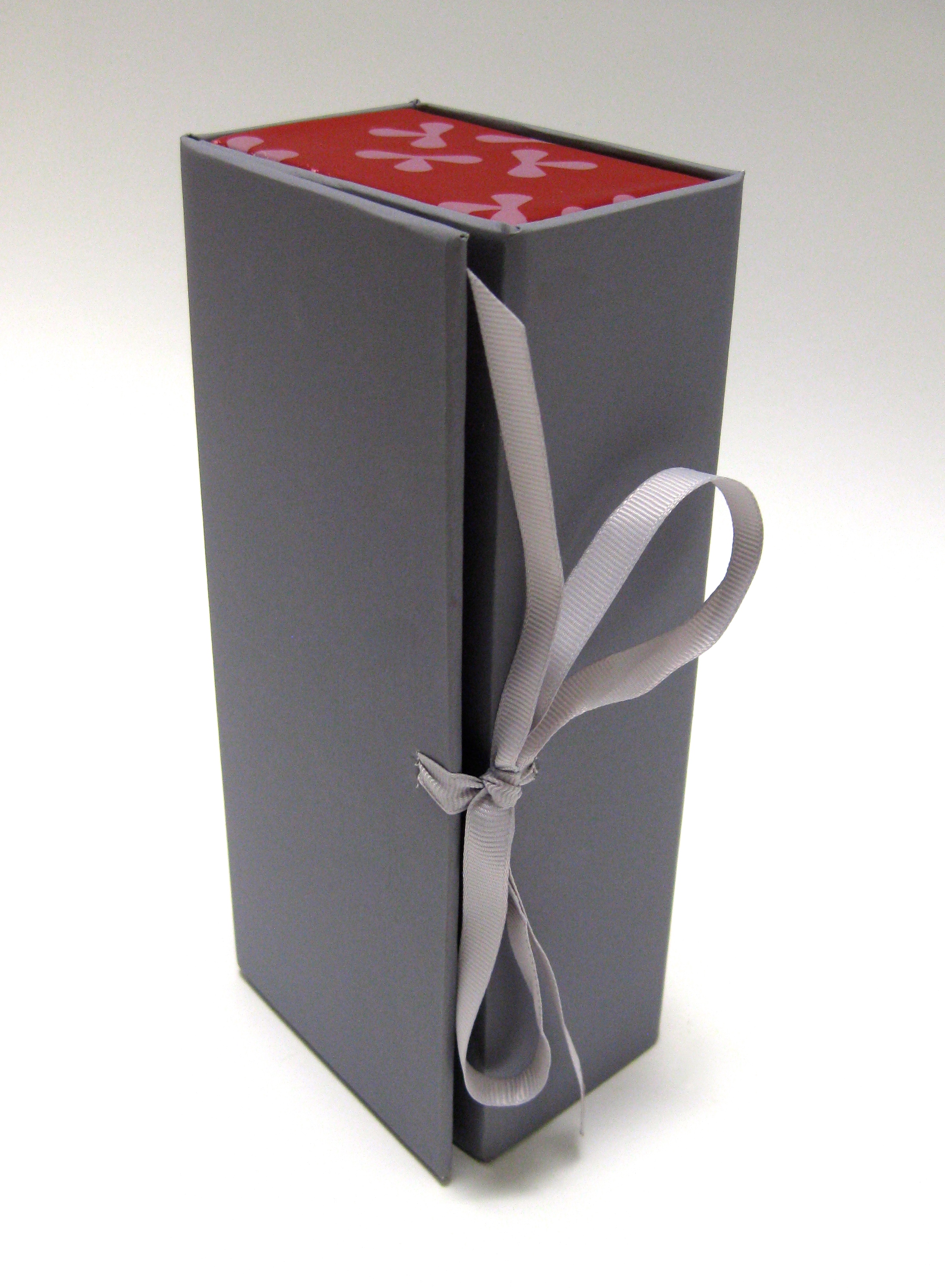
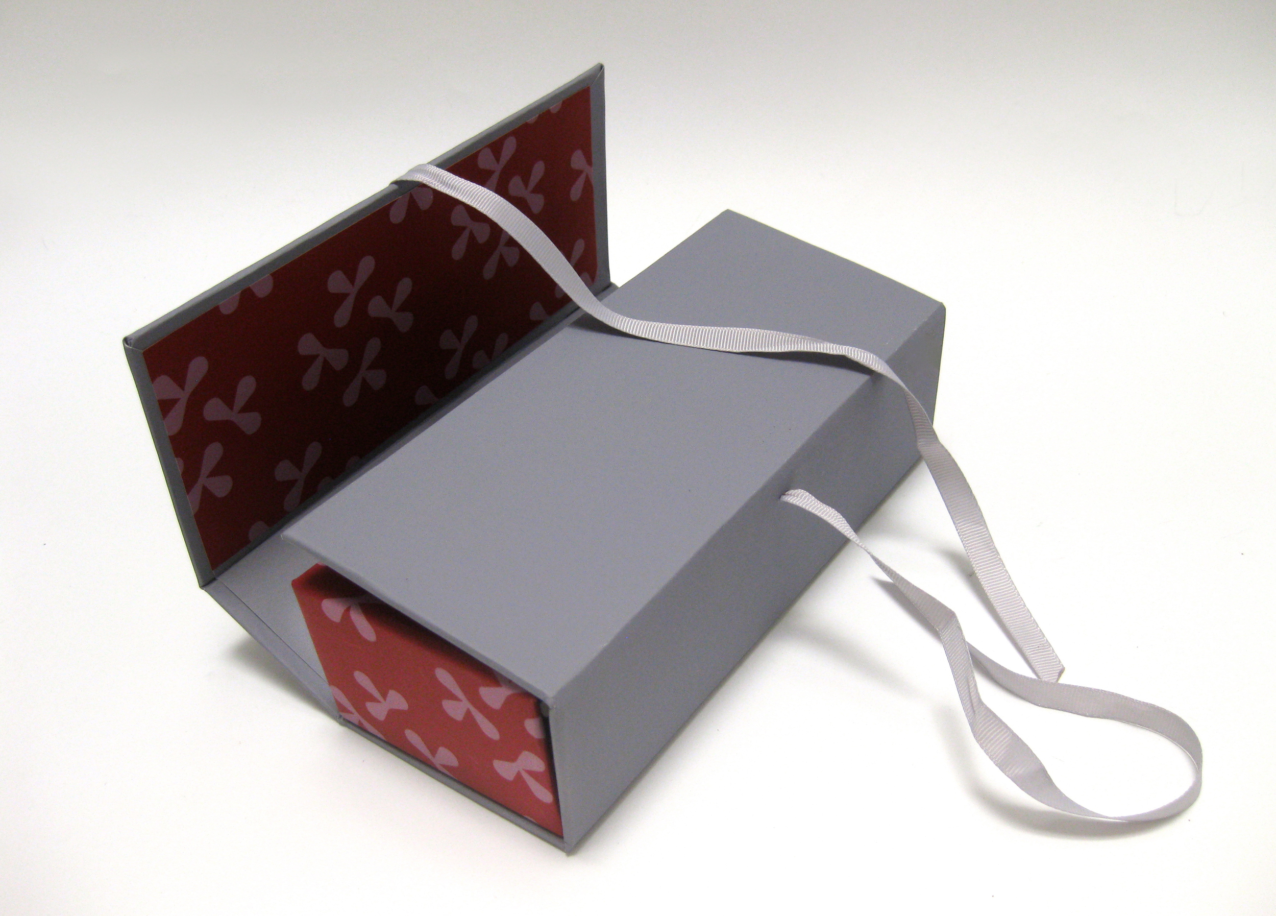
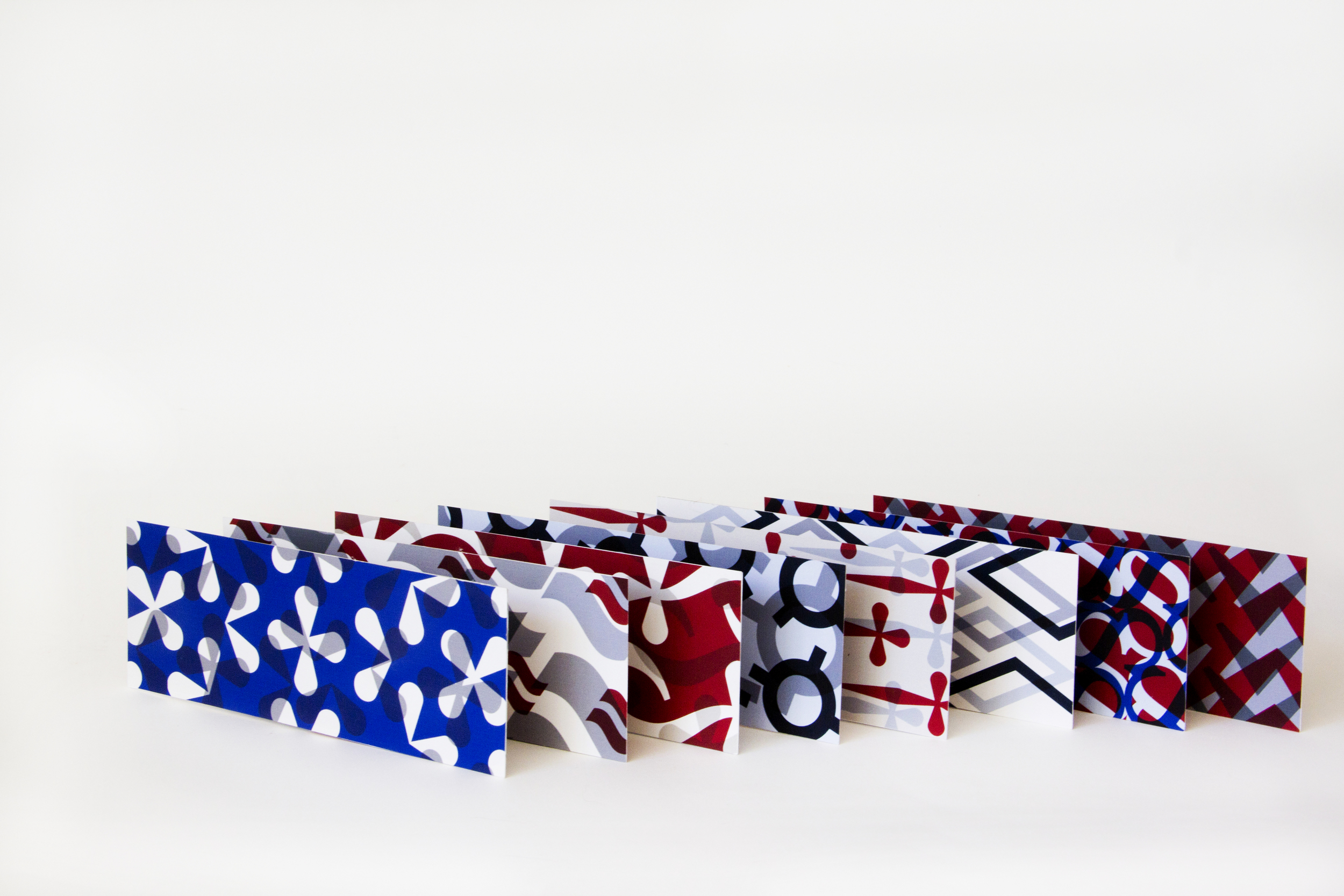
the reveal / I chose Mrs Eaves as the typeface and literature as the subject study. I felt inspired by the works of Jane Austen and I thought they were the perfect fit with the parameters given, as well as the typeface. In line with literature, I created the cards as a set of bookmarks. I used Edwardian and Victorian colors taken from the fashion of the time to give a sense of properness and regalia. I showcased Mrs Eaves in a very structured way in accordance with the proprietary sensibilities of the times. On the back of the cards, however, I decided to have a little fun, and used the wonderful glyph palette from Mrs Eaves to create exciting and visually engaging patterns. I used those same colors and patterns to construct the box that hold the cards. I named my cards in line with Jane Austen's compound novel titles (Sense & Sensibility, Pride & Prejudice.) The Mistress & The Spinster came from both Mrs. Eaves and Miss Austen, since one was John Baskerville's mistress and the other never married.
awards & publications / Creative Quarterly Magazine 37.