
WARNING : This book contains material that can be offensive to certain sensitivities.
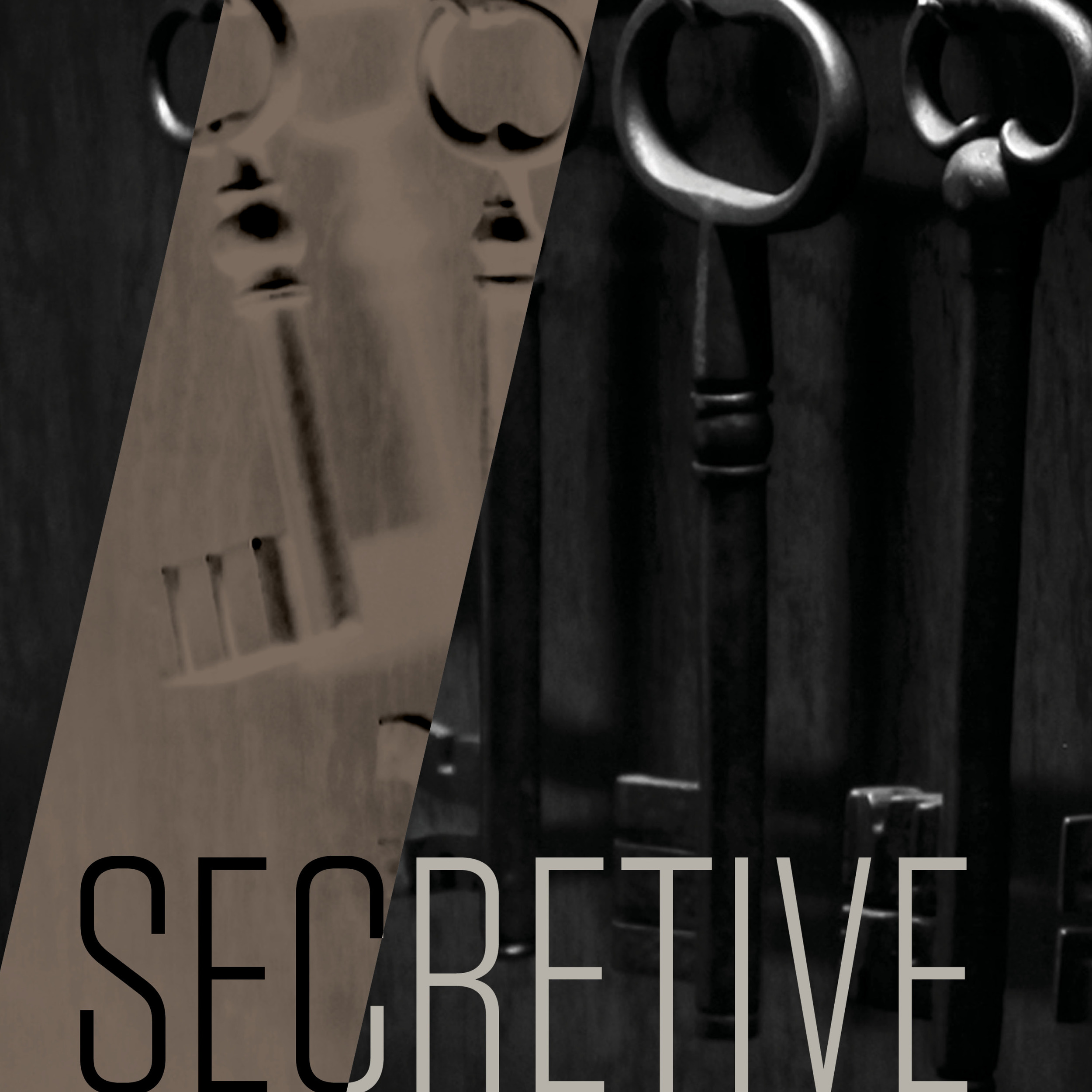
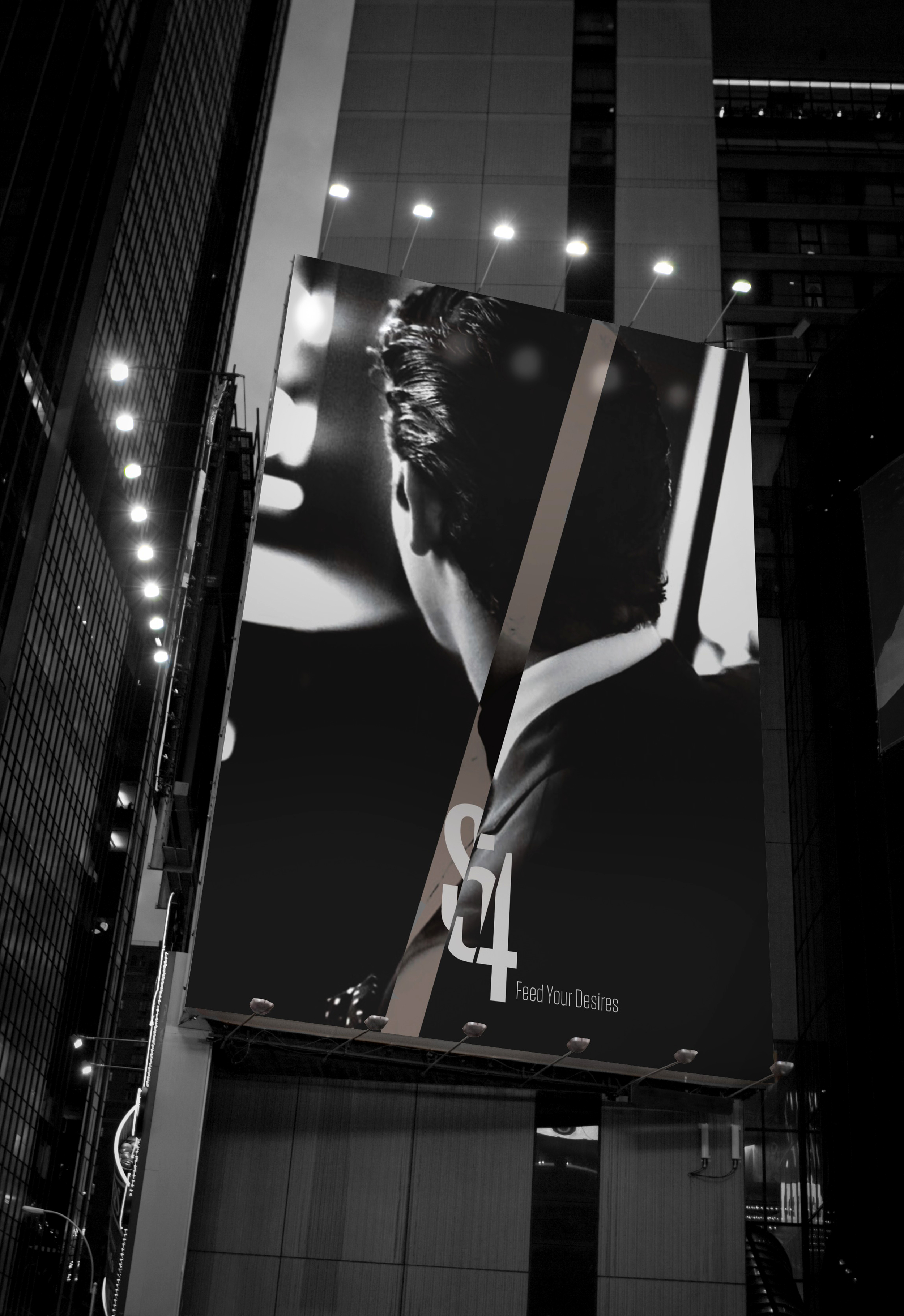
S54 - The Rebranding of Studio 54
the brief / To take a dead, dying or defunct brand and bring it back to life. The project asked me to create a new brand but still keep the original soul of the firm that made it in the first place. We had free rein on how far we wanted to push the envelope and were encouraged to think outside the box.
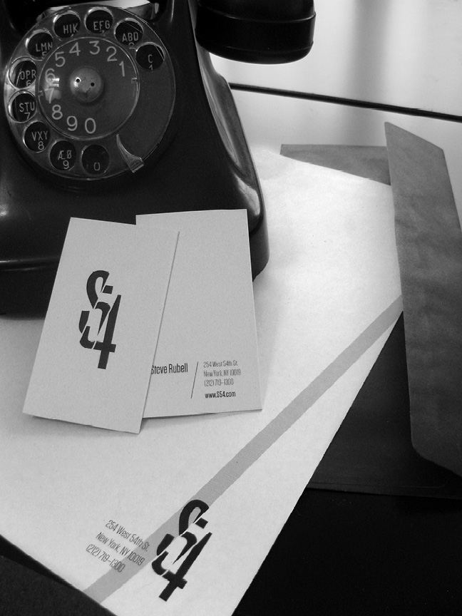
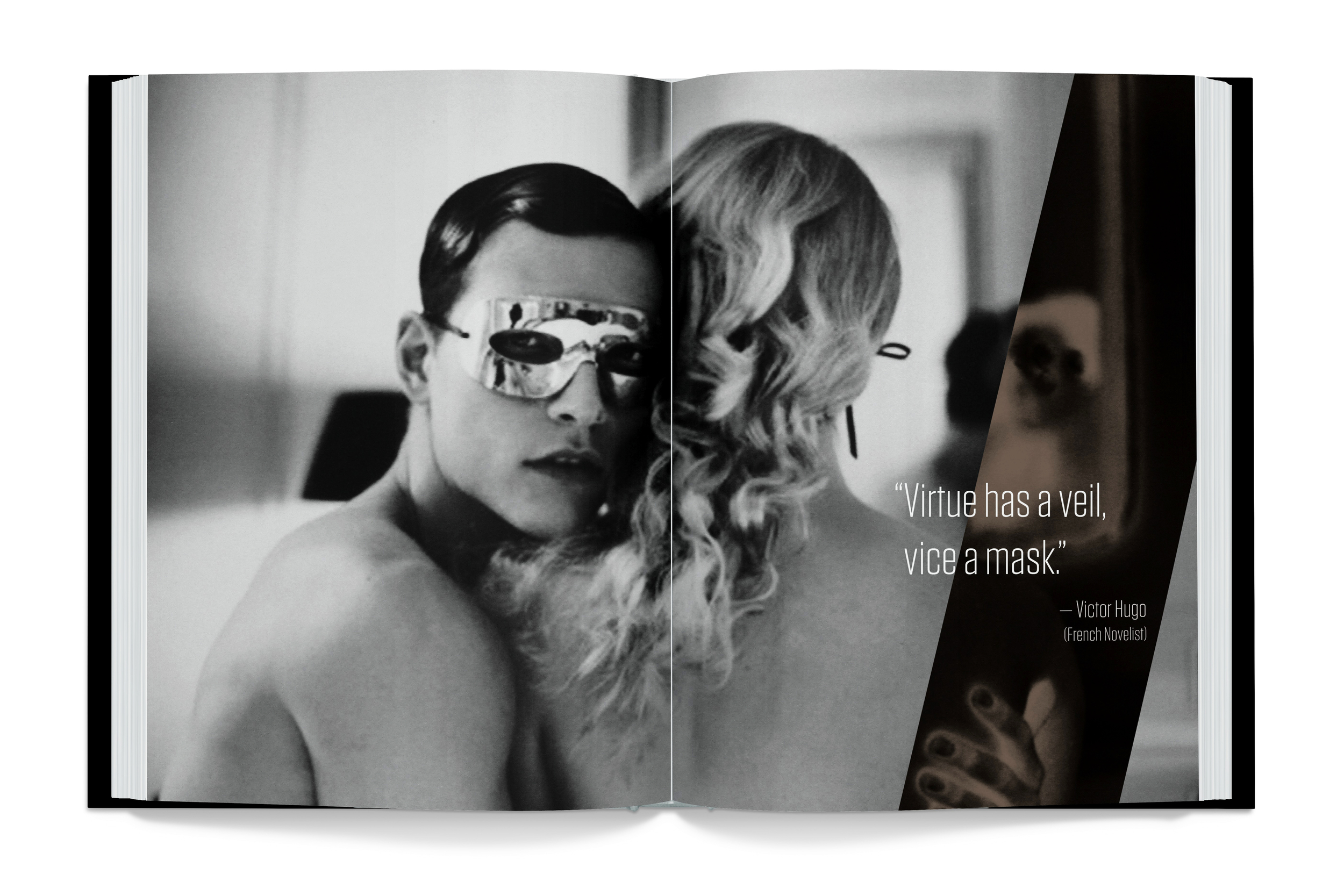
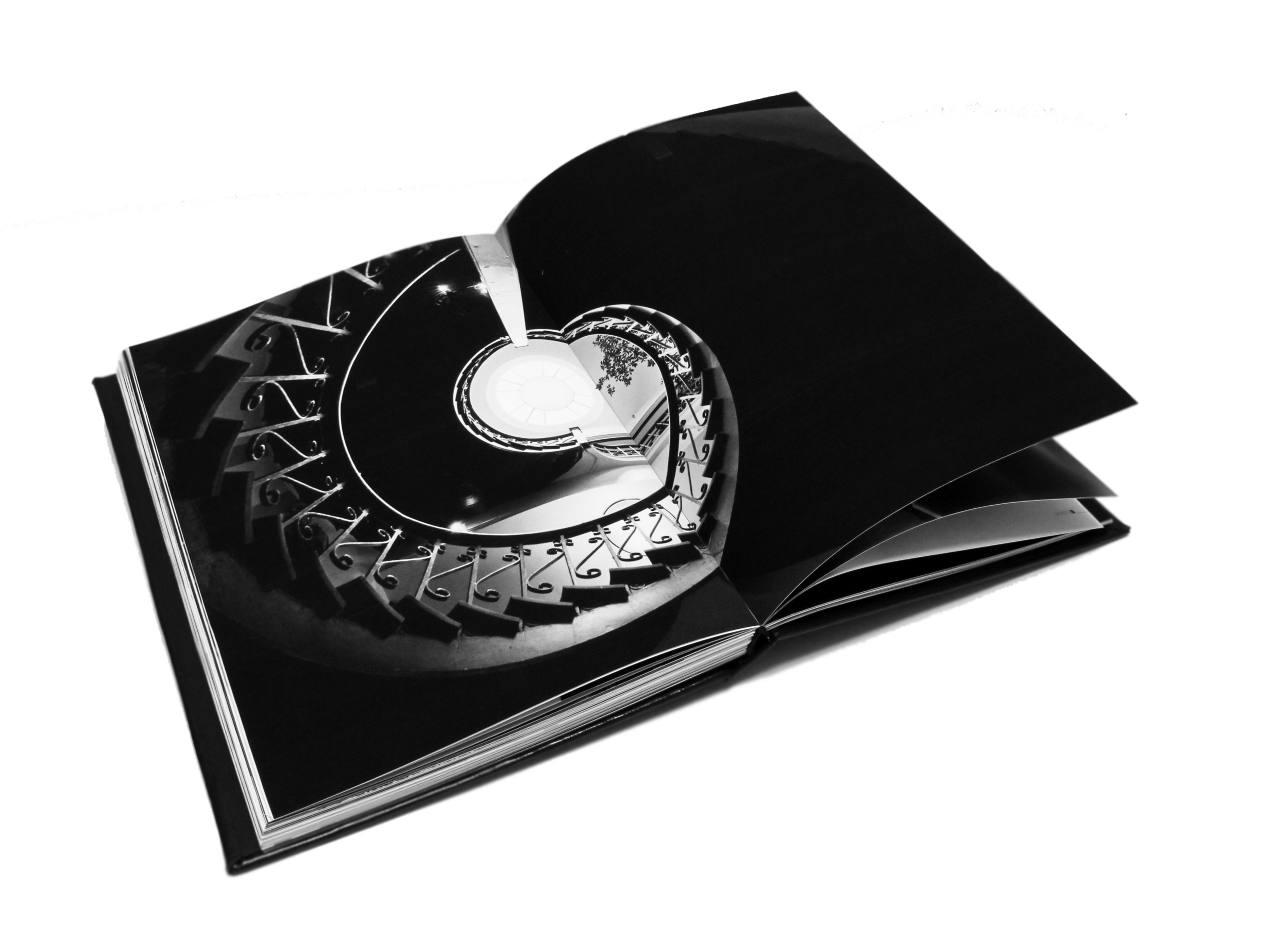
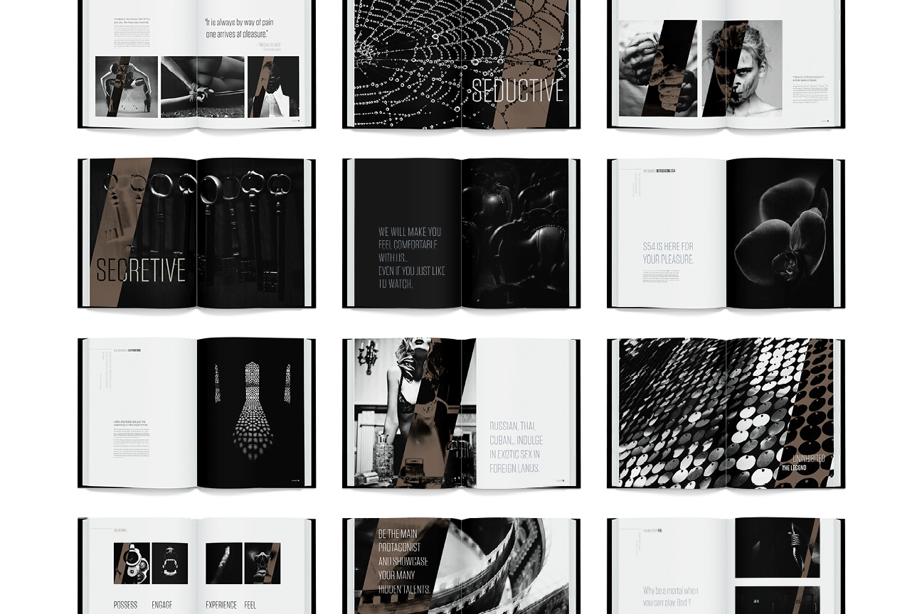
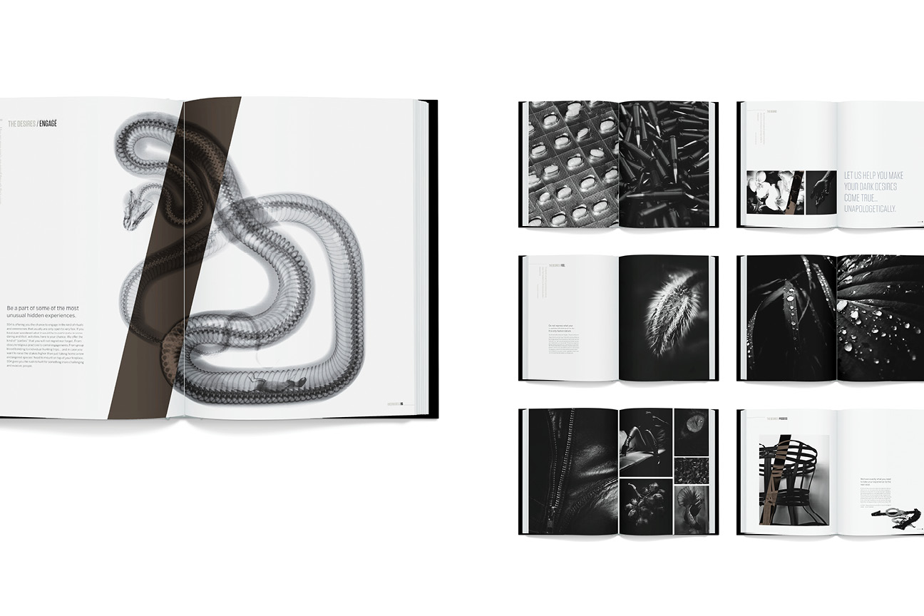
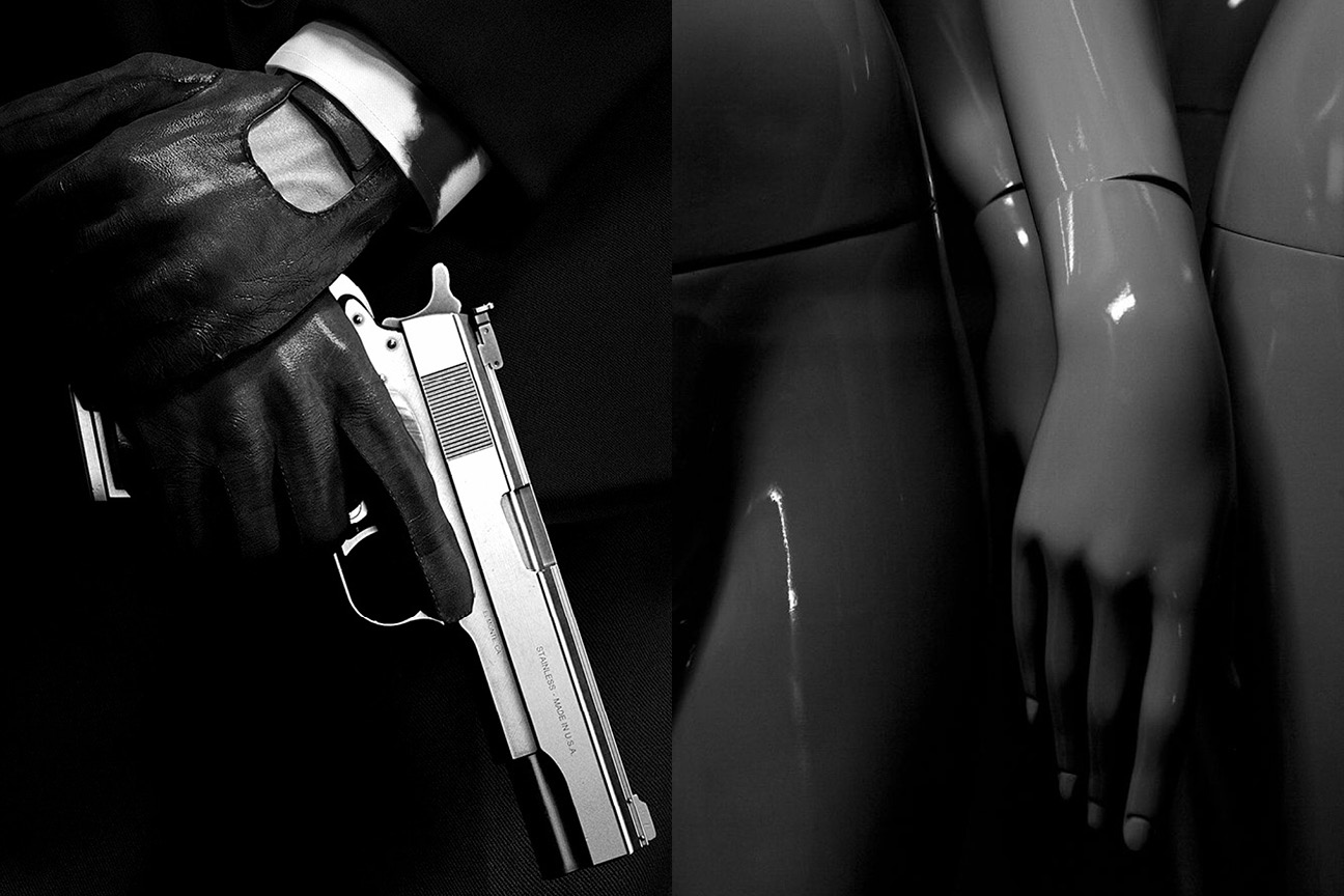
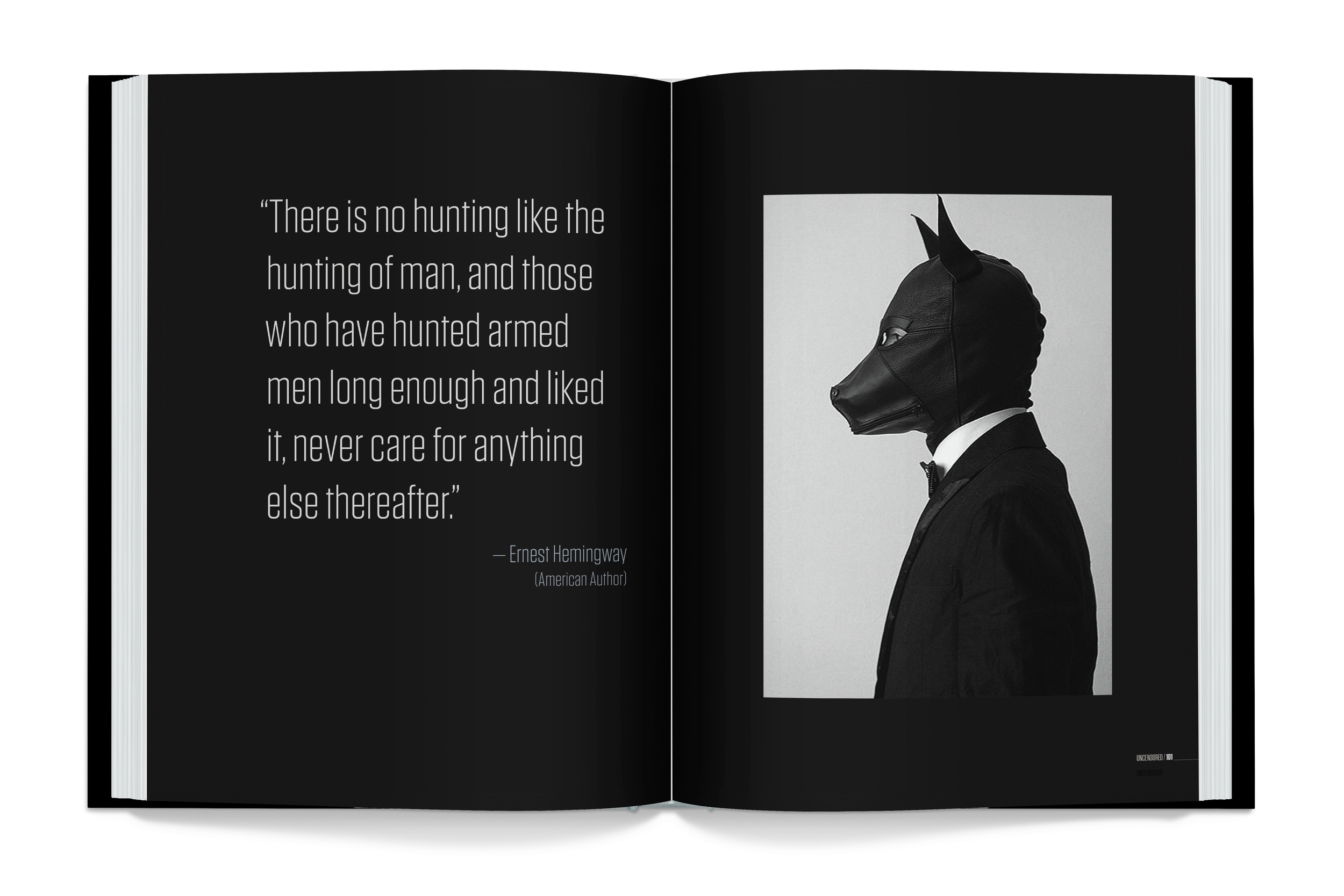
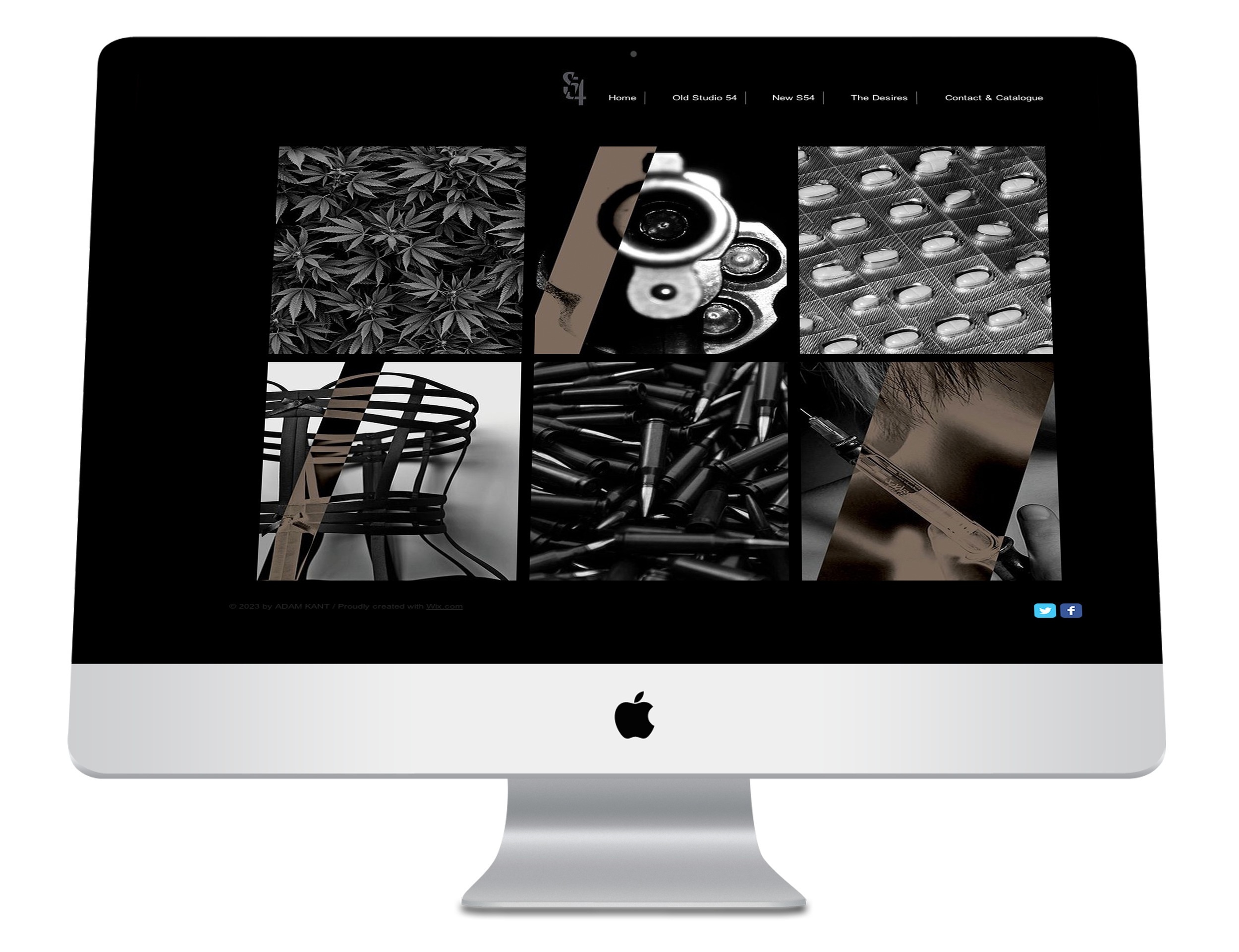
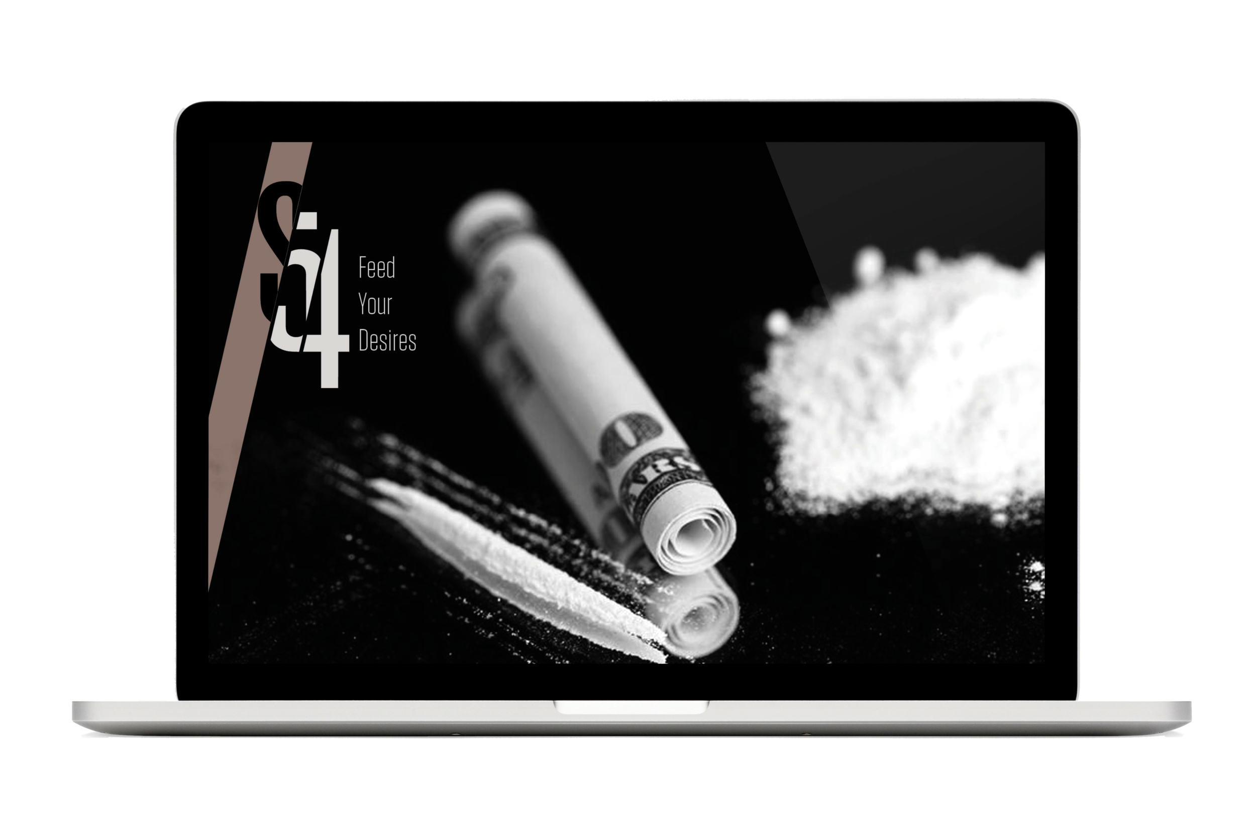
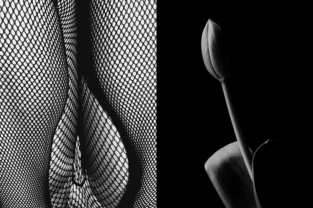
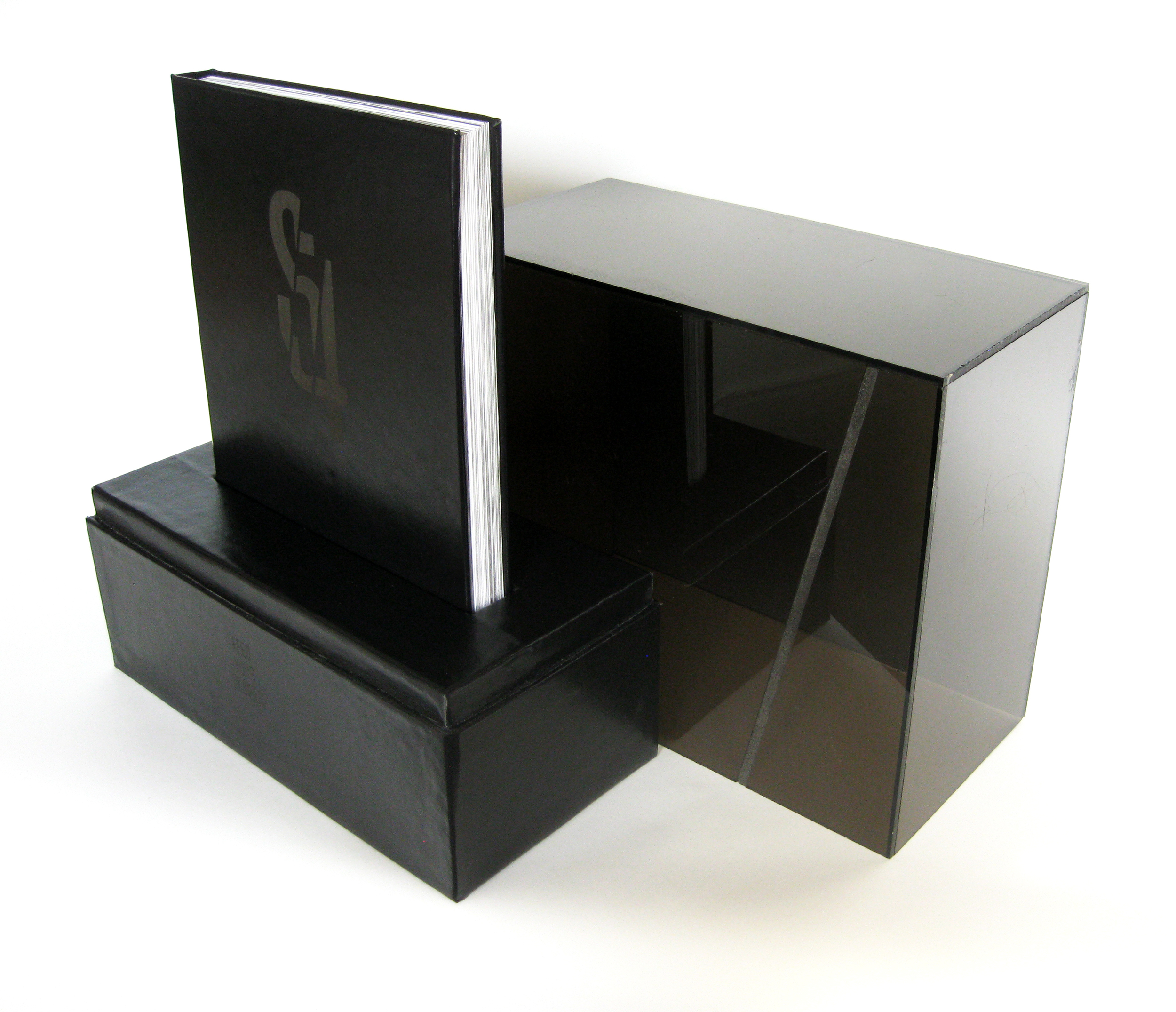
the reveal / I decided to take on Studio 54; the iconic and legendary nightclub from the late 1970's which became infamous for its parties filled with celebrities, sex, and drugs. I took the new brand, S54, into the dark realm. I thought it would be a good idea to have fun and produce a project that — if it wasn't for the fact that I was doing it as a school exercise — could not be done anywhere else in the real world. I wanted to push myself and explore the boundaries of what branding could be. S54 caters to the dark desires of its customers. It allows people to explore that private hidden side of themselves, without restriction. I took the basic idea of Studio 54, where wild parties would come to life, and people would behave in an uncensored way, and brought it to the edge of what it could be. Some of the services that S54 offers are illegal and/or unethical, but the brand is not here to cast any judgment, but be an avenue to pursue those experiences that customers seek. I decided to limit the color palette to mostly black and white, since the brand lives in the shadows. I wanted to give S54 an aura of mystery, darkness, seductiveness, and danger. The main graphic element, the slash, is precisely angled at 77°, as an homage to 1977, the year that Studio 54 opened its doors for the first time. The final S54 coffee table book lives inside a leather and acrylic box, since the brand is not for everyone's reach. S54 is an exploration into the unknown along with the reconciliation of one's dark desires.
awards & publications / Creative Quarterly Magazine 35.